
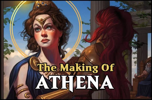
The Making of Athena
In this tutorial, I will reveal my process for drawing and painting 'Athena' from Greek Mythology.
I will be using Photoshop and a Wacom Intuos Pro tablet to draw and paint the illustration, which is how I've been working for years now. Alternatively, other digital painting programs should work just as well, including an iPad Pro with Procreate. Now then, let's get started!
When creating an illustration, it's best to gather some reference and inspiration material for the project to better help you visualize what you have in mind. Really get a solid understanding of what you'd like to depict as that creates more believable results. Take your time here. Go with what feels right and have fun!
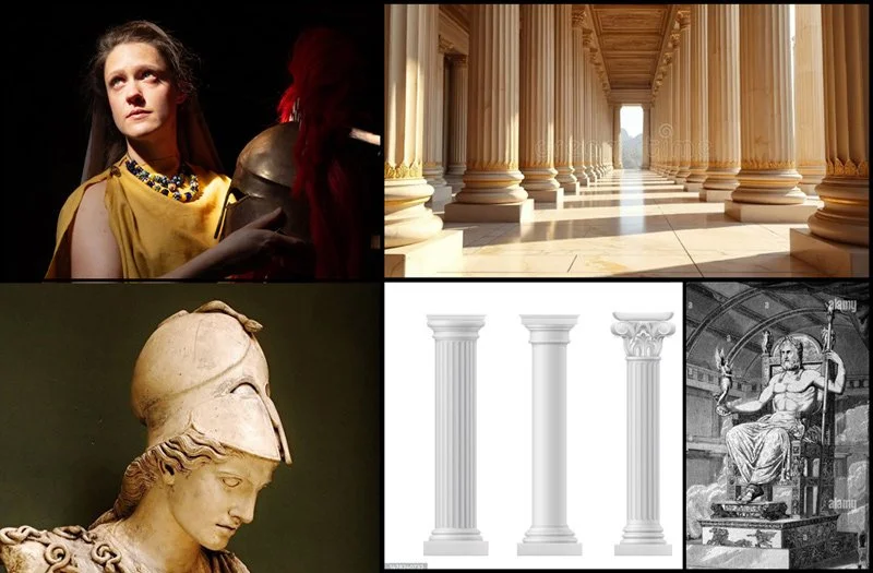
For the figure I'm referencing a photo from one of Satine Zillah's excellent 'Greek' reference packs, which helps me visualize the figure in terms of general pose and character design as well as lighting. My goal isn't to do a direct copy or study from the photo, but to help me draw out a general pose, while taking many artistic liberties in the character design to help keep things interesting while drawing and painting in my own style.
STEP 2: Rough Sketch

I begin to lay in a rough sketch for the figure. I'm using a hard edged brush with hardness set to 100% with a pure black color, with opacity set to only 15%. I find this emulates sketching with a pencil extremely well.
What I'm trying to do here is to establish the pose and gesture first and foremost, then fill it in with basic shapes, using a reference as a guide. I'm also trying to feel out the environment and perspective, although I'm concentrating on the figure first and foremost. Take your time here as having a strong foundation will ultimately make things easier as we continue to refine the sketch.
Try to avoid working fast at this stage - take your time, work loosely but try to avoid drawing too 'quickly'.
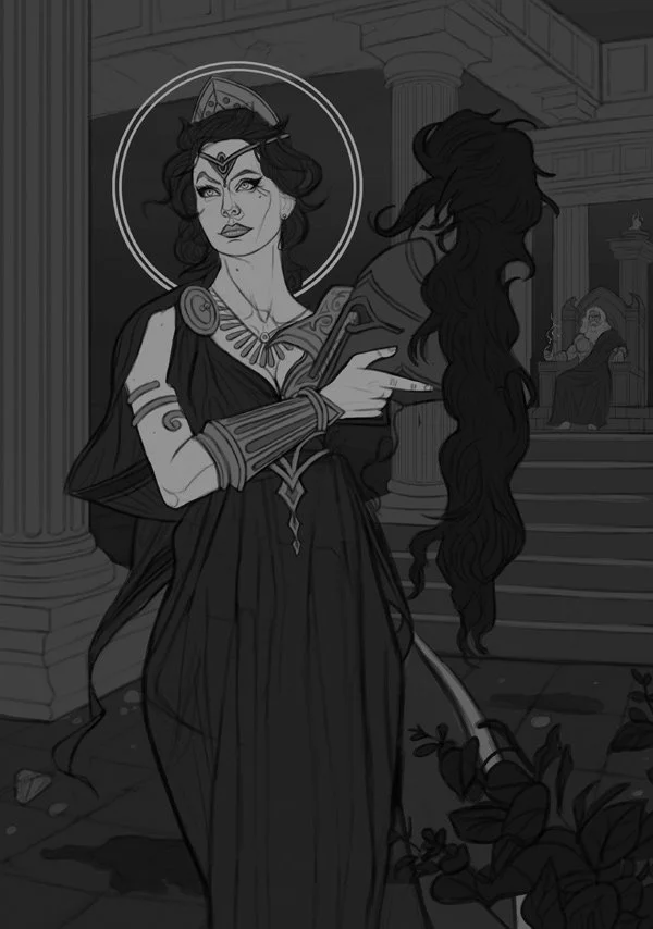
STEP 3: Refine Sketch

The proportions for the figure look fairly solid now, so I decide I'm going to begin to refine the figure a bit further. The first thing I do is lower the opacity of the rough sketch layer to roughly 40%, then create a new layer on top of it where I'll draw over the previous sketch for a much more refined and professional look. I begin with the face as that will be the main focus of the image and refine it from there. I'm not concerned too much with line weight just yet, as I'm still working at a fairly low opacity and aiming for a clean look.
I'm also experimenting with the look of the background at this stage (also in it's own separate layer), although again, nothing is final at this point.
STEP 4: Further refine the sketch

I continue to refine the sketch as a whole, developing both the character and the environment further. I'm taking my time here as establishing a strong sketch will ultimately make the painting process faster and easier. I'm also happy with how the background is developing and decide to add a staircase as well as Zeus in the far background. I also sketch in a plant on the foreground, as this gives the image a more dimensional look and helps sell the illusion of 3D space.
STEP 5: Finalizing the sketch

I used a handy perspective brush to make sure I get everything right regarding the environment. At this stage everything looks solid, but Athena is looking a bit too plain and boring for my taste, so I refine the sketch for a more regal look - much more appropriate for the Goddess of Wisdom!
I also work on the line weight of the sketch by increasing the opacity of my hard edged brush to as much as 40% for darker values, still with a solid black color.
Once I feel the sketch is finalized, I show it to some friends, both artist and non-artist alike to get their input on it. It's imperative that the sketch is as good as it can be at this stage which is why I always request feedback before I commit to painting the image in. I apply any final input and finalize the sketch. Now it's time to begin the coloring phase!
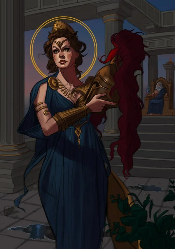
STEP 6: Flat colors with limited values

Once I'm happy with the sketch, I decide to begin the painting process. The first step to any good painting is to always a establish a strong value statement, while keeping your values limited to 3-5 shades. Many artists generally begin with grayscale first and add colors later, but I generally tend to avoid this technique as my colors end up looking too muddy if I go that route. Instead what I do is begin with basic flat colors and adding a 'grayscale' layer on top of all the layers to see how the image looks like with no color.
Doing this is simple, simply create a new layer in Photoshop (or a similar program) and set it to 'color' - pick any gray color and fill it in with the Gradient Fill Tool - and that's it, you'll immediately see how your image looks in black and white!
The lightest values in general should generally be the focal point of the image (although there are exceptions depending on what exactly you're trying to achieve). Notice how in grayscale the character's skin and 'halo' are the lightest tones of the image, immediately making the character 'pop'. This is exactly the effect I was looking for. If you're struggling with establishing good values I recommend working strictly in grayscale first or keeping your colors extremely limited. Values are ultimately much more important than colors, as a general rule.
STEP 7: Establishing lighting

Once I'm happy with how my basic colors and values work, the first step is to decide the lighting set up. In this case I want the light to come from the sun, located in 'front' of the image and on the top left. This lighting setup is very popular and is great for establishing forms. Keeping the light source in mind, I begin adding the first shading on the figure, working with darker values first. Using shadows first to help define form works better for me than adding highlights, but feel free to use whatever technique you're most comfortable with.
I begin by adding darker tones to the skin, gold, and dress of the figure using Photoshop's excellent 'HSB' color slider (this slider is what I use exclusively to pick out colors for my painting). I'll be using this technique exclusively for my color work.
STEP 8: Deeper Shadows
I'm still working exclusively with shadows at this stage to help establish form and lighting. I apply much darker tones for the figure to give her a more realistic look, and also apply the same technique to Zeus in the background, as well as the environment in general. If you're having trouble shading skin or figures in general, try to think of them as simple forms such as cylinders, cubes, etc. and shade according.
I notice the value work of the sky is much too dark, it blends too much with the architecture in the environment so I decide to lighten it a bit using Photoshop's excellent "Hue/Saturation" option. I simply increase the brightness and saturation slightly.
Always keep your light source in mind when shading, as consistency is what will ultimately sell the image. If you're struggling with lighting I suggest doing tons of studies based on simple shapes as this will help you understand lighting much better. Doing photo studies of stills from your favorite TV show or movies is also something I highly recommend.
STEP 9: Adding highlights

I'm pretty satisfied with the direction of the image, and I concentrate my efforts mostly on the figure here. I feel Athena could benefit from lighter values so I introduce highlights to the figure for a more believable and realistic look. It's worth noting that all my brushwork here is exclusively done with a hard edged brushes with hardness set to 100% - the main reason is that hard edged brushes are excellent for establishing form. We can soften out some areas later if needed, such as Athena's skin for a more elegant, slightly softer look.
Furthermore, taking a look at the background I decide to add various leaves to break up the monotonous feeling of the environment. It also helps add more color variation which is also a plus! I also begin some texture work here, using custom brushes that come in handy for this sort of work.
STEP 10: Refinement and Detail Work
I'm happy with how the image is turning out, as the colors and values appear to be working quite well. It's at this point I decide to begin doing some more serious detail work. I refine Zeus considerably and smoothen out Athena's face.
I also want to give Athena a bit of a softer and smoother look, so I chose a soft edged brush with hardness set to 0% and an opacity of 35% to blend in the skin, specifically. I also lighten Athena's skin a bit further to make her pop out even further by using Photoshop's excellent 'Levels' tool.
STEP 11: Take A Break!
The image is entering the final stages at this point. If you have the option available, I highly recommend taking a few days off of working on it so you can give the illustration a fresh look when you come back to it later. This helps makes errors stand out more and gives you more breathing room to improve the image with new ideas if necessary. Another tip is to always flip the image horizontally every now and then to help spot errors early.
STEP 12: A Fresh Look and Some Tweaking

Returning to the image after a few days, I make some mental notes on what can be improved. I feel the painting can benefit from more color variation, so I proceed to add more tones to give the image more variety and complexity in that regard. This step is pretty step forward as my value work is already in place, so it's just a matter of enhancing the colors. I also recommend experimenting with a new 'color' layer on top of each element to push your colors as far as they can go!
It's time to experiment with some Photoshop tools to give the illustration some minor improvements. First off, I have a habit of oversaturating my illustrations during the painting process, so a nice way to help rectify this is by using Photoshop's excellent 'Vibrance' tool (Image > Adjustments > Vibrance) and bringing the vibrance down slightly to give it a more natural look. This also helps give the skin a slightly 'transparent' effect which gives it a more realistic appearance.
Next up we will tweak the values just slightly to give the image a slightly lighter and brighter look to make the image 'pop' a bit more. To do this, select Image > Adjustments > Levels in Photoshop and experiment with the slider a bit until you get the desired results.
STEP 13: Applying Feedback and Final Finish
The illustration is pretty much there at this point. What I do now is show it to friends and loved ones for some final feedback, both artists and non-artists a like to collect some feedback. Try not too take feedback too personally and focus on constructive critiques first and foremost. One element that was pointed out to me is that the base/bottom of the columns don't match, so I went ahead and fixed that issue. I also added some hints of green moss here and there on the architecture to help bring the image together. Finally I introduced a more saturated and slightly darker bluish tone to the sky to help make the figure pop out a bit more.
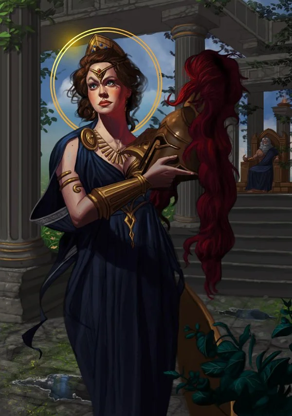
And that's pretty much it! I'm calling it done. Here is the final image:

STEP 1: Research and Reference Material
Final Thoughts
I hope you enjoyed reading about my process for 'Athena: Goddess of Wisdom'. I had a blast bringing the illustration to life, and things went much more smoother than they usually do during the painting process (probably because I achieved the colors and values pretty much as I wanted them from the beginning, so don't rush the initial steps!).
Please feel free to reach out directly to me via e-mail should you have any questions or comments. Happy painting!
......................